HireFlow: Modernizing job application tracking.
The job application process is overwhelming (multiple applications, scattered deadlines, lost recruiter names. I designed HireFlow, a centralized platform where job seekers can track applications, manage documents, and visualize their search through insightful dashboards.

Organizing the chaos of job searching.
Felt more organized
Participants reported feeling significantly more in control of their job search after using HireFlow.
Identified search trends
The dashboard helped users spot patterns they'd missed (which industries, locations, and stages they clustered in.
Saved per week
Users reported saving over two hours weekly compared to their previous spreadsheet-based tracking methods.
Spreadsheets weren't built for this.
Job seekers juggle dozens of applications across companies, roles, and timelines. The tools they use, mostly spreadsheets and scattered notes. weren't designed for this workflow. Details get lost, documents pile up, and there's no way to see the big picture of where your search actually stands.
Lost application details
Dates, recruiter names, statuses, and follow-up notes scattered across multiple spreadsheets and email threads.
Document management chaos
Resumes, cover letters, portfolios, and certifications buried in folders with no connection to the applications that need them.
No visibility into progress
No way to visualize patterns (which industries respond, which locations cluster, how many apps are stuck in review.
Interview scheduling stress
Keeping track of upcoming interviews and deadlines without a unified calendar view leads to missed opportunities.
What 11 job seekers told me.
I conducted interviews with 11 active job seekers to understand their workflows, frustrations, and the tools they relied on. The patterns were striking, nearly everyone used spreadsheets, nearly everyone hated maintaining them, and almost no one had visibility into the overall shape of their search.
Relied on spreadsheets for tracking and found them time-consuming to maintain
Struggled to manage document requests from recruiters across applications
Wanted a visual representation of their application statuses and progress
From interviews to high-fidelity.
Four tabs that replace the spreadsheet.
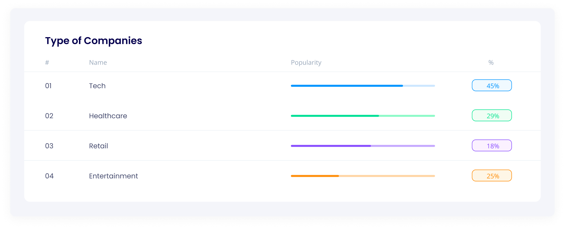
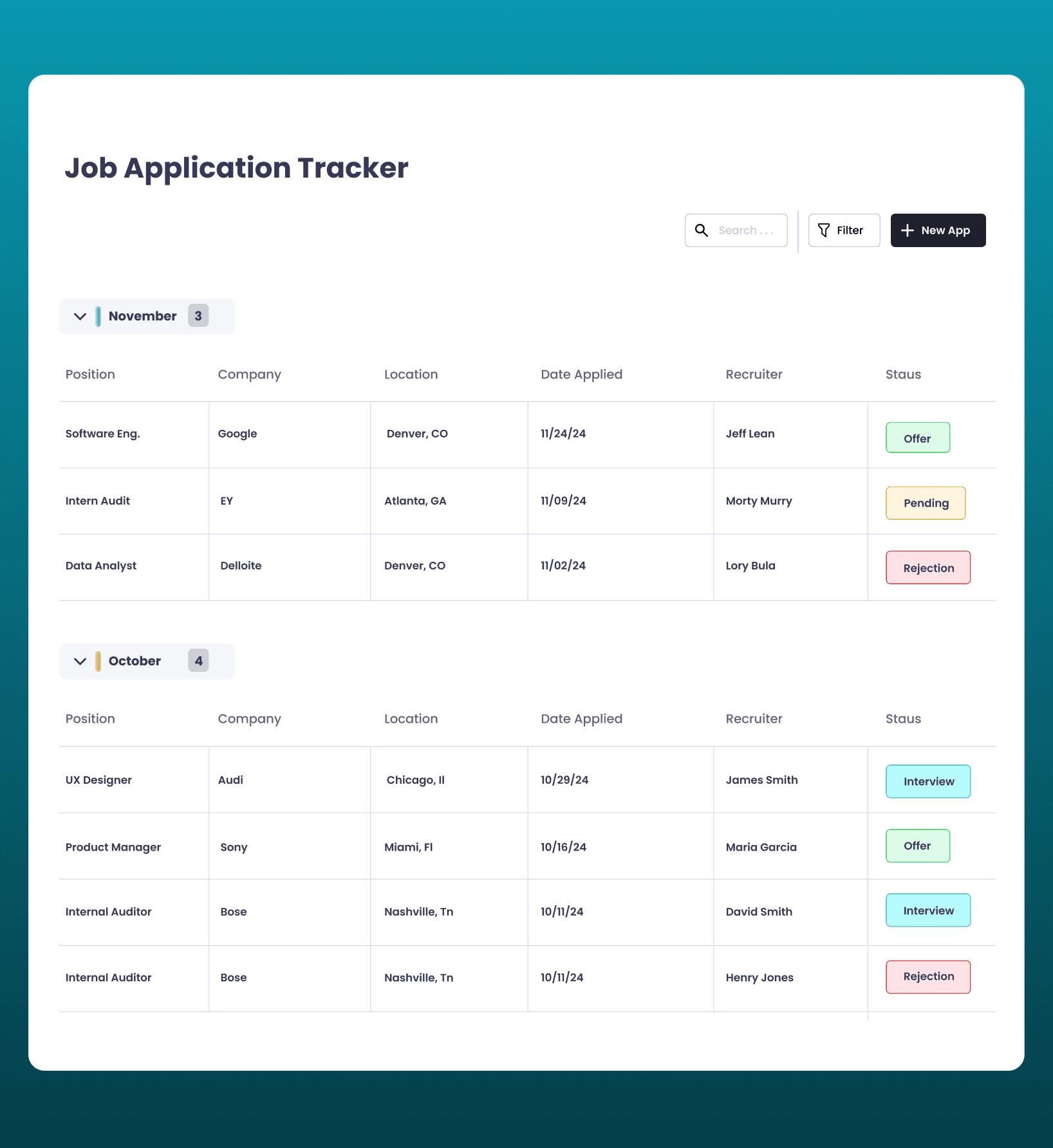
Applications Tab
A comprehensive tracker where users record every detail application dates, company locations, recruiter contacts, current status, and notes. Everything that used to live in a messy spreadsheet, structured and searchable.
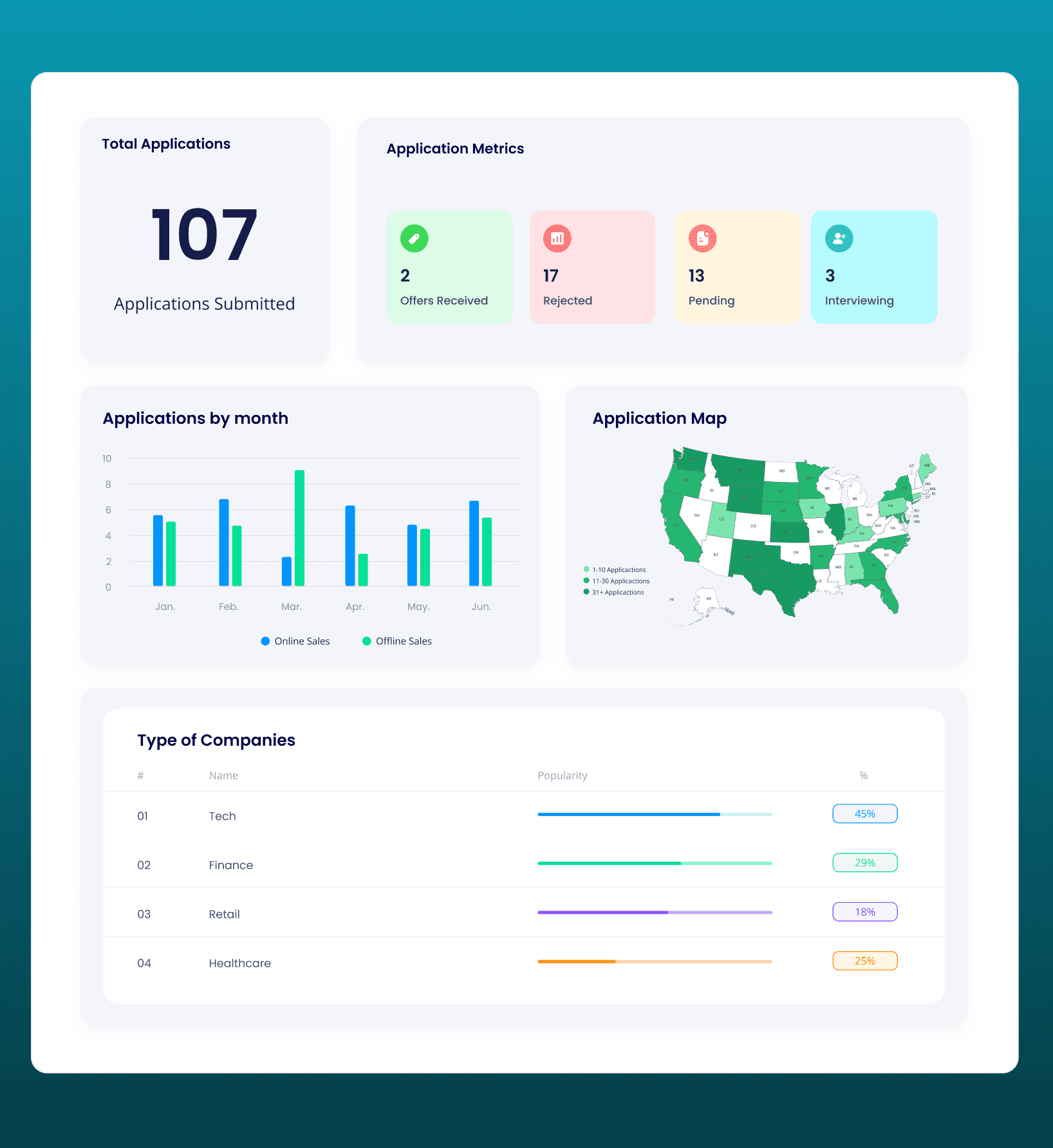
Dashboard
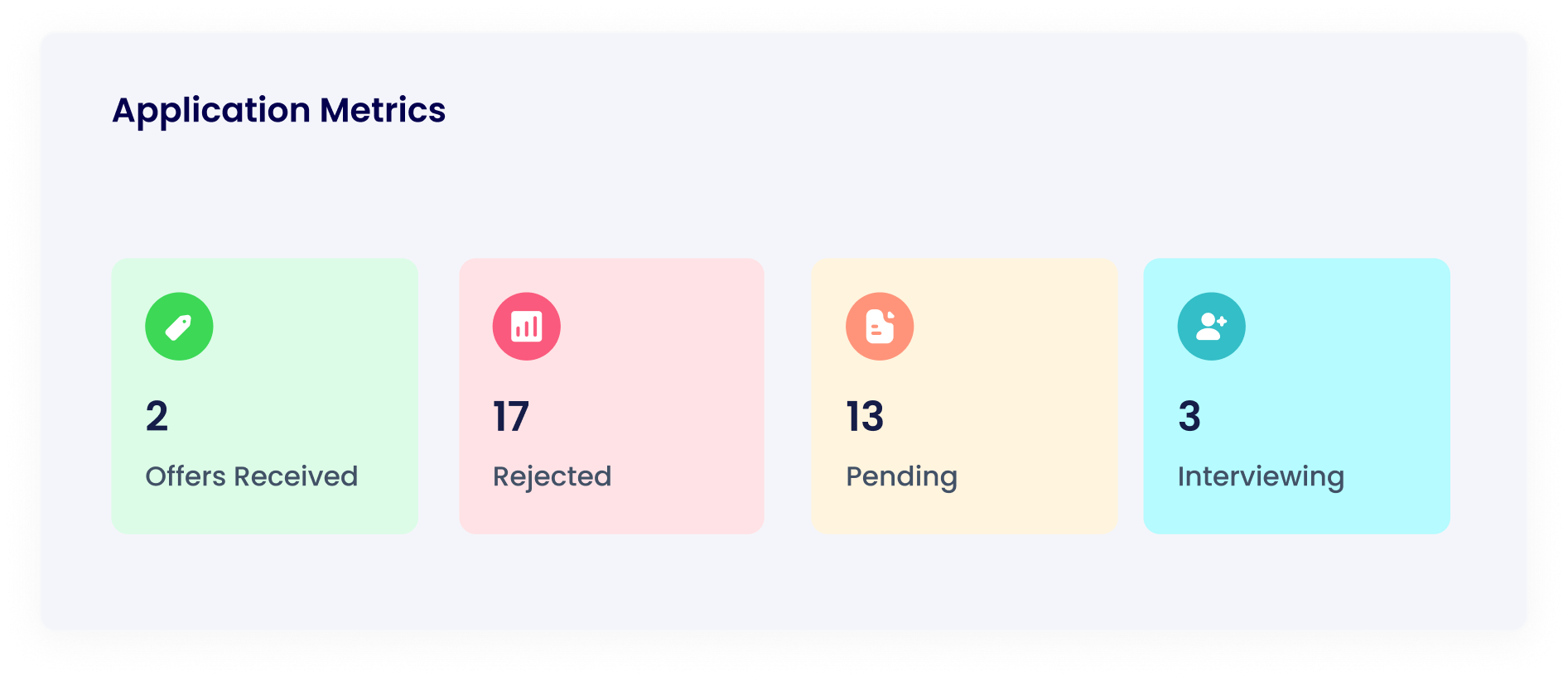
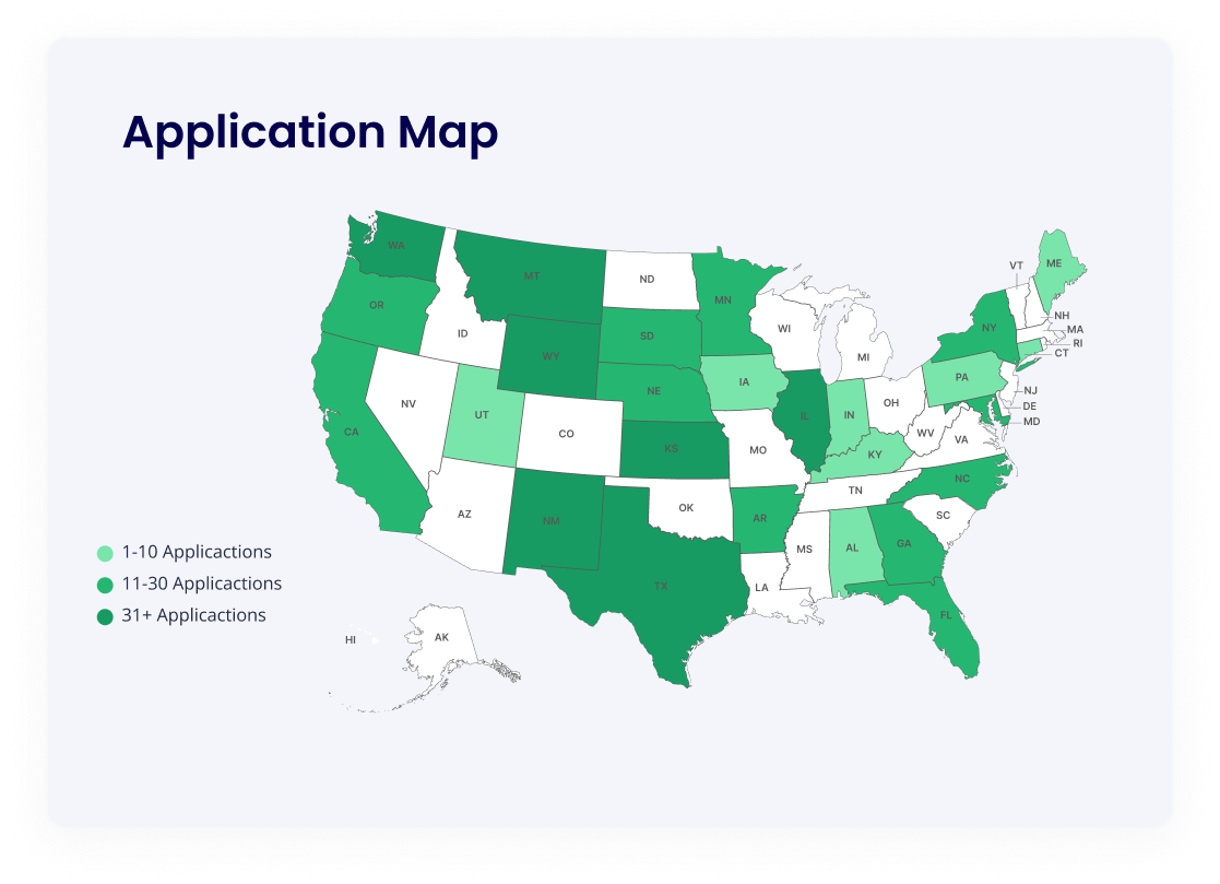
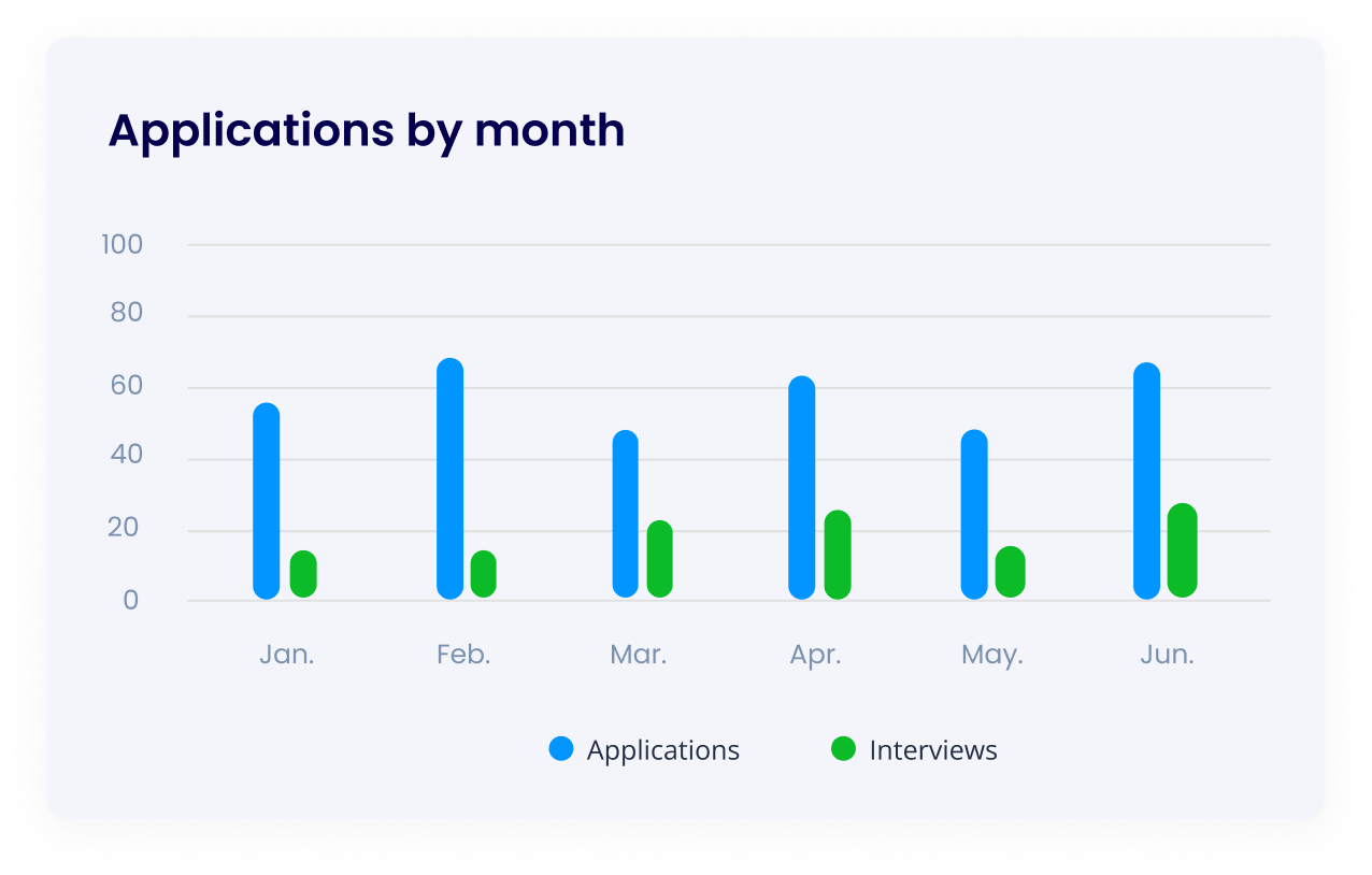
Visual overview of your entire job search: total applications, monthly trends, a US heat map of company locations, industry breakdowns, and status distribution. The feature users loved most.
Documents Tab
Centralized document management for resumes, cover letters, portfolios, and certifications. Customizable categories based on usability testing feedback, so your materials are organized the way you think about them.
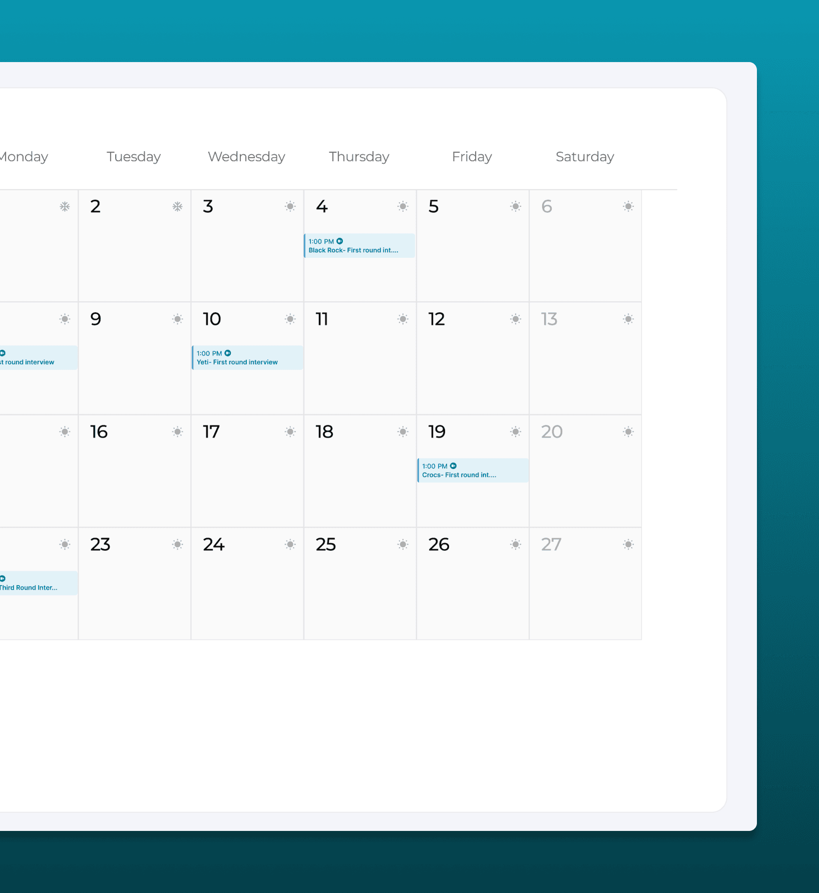
Calendar Tab
Visual calendar for scheduling and organizing interviews. See upcoming deadlines at a glance, reduce the anxiety of missed appointments, and keep your interview pipeline visible.
The shipped prototype.

The heat map feature is such a game-changer. It gives me a clear visual of where my opportunities are concentrated, and it helps me decide whether I need to expand my search to other areas.Vasa Vanmury · University of Louisville Alum · Job Seeker
What testing taught us.
The heat map was the breakout feature
During usability testing, the US heat map of application locations consistently generated the strongest reactions. Users hadn't realized how geographically clustered their search was until they could see it. This visual insight changed their strategy, several expanded their search radius after seeing the concentration.
Customizable document categories
The initial design used fixed document categories (Resume, Cover Letter, Portfolio, Certification). User feedback revealed that people organize their materials differently, some by company, some by role type, some by date. Adding customizable categories increased the feature's utility significantly.
Dashboard-first navigation
Early wireframes opened to the applications list. Testing showed that users wanted to see the big picture first, how many apps are out, what stage they're in, where they're applying. Moving the dashboard to the default view matched the mental model of "checking in on my search" rather than "adding another row."
Manual input was intentional
Some testers asked about automatic application imports. We kept input manual for V1, the act of recording an application creates intentionality, and auto-imports from job boards often pull in speculative clicks that aren't real applications. Manual entry keeps the data clean and the tracking meaningful.
Where HireFlow goes from here.
Automated data input via API
Integrate with job boards and email to auto-populate application details, reducing manual entry while maintaining data quality through user confirmation.
Interview notifications and reminders
Push notifications and calendar sync for upcoming interviews and follow-up deadlines, reducing the anxiety of missed appointments.
Enhanced analytics
Deeper insights into job search efficiency: response rates by industry, average time-to-interview, and which application strategies yield the best results.