Rethinking Venmo for shared expenses.
Venmo is a widely used mobile payment service, but its current design lacks the tools needed to manage shared expenses effectively. Users resort to external apps like Splitwise to track group payments; leading to fragmented workflows and inefficiencies.
Faster settlements, happier users.
Preferred "Trips" over external tools
Users preferred the integrated Trips feature over using Splitwise or other third-party apps to track shared expenses.
Found the new payment flow more intuitive
Redesigning the payment flow to prioritize transaction details before recipient selection improved perceived ease of use.
Improvement in payment flow efficiency
Fewer taps and a clearer information hierarchy led to faster payment completion across all test participants.
Growth in recurring transactions
Projected first-quarter growth in recurring payments after adding visual indicators and a simplified setup flow.
Three problems holding Venmo back.
Limited Group Payment Tools
Users struggle to split bills and track shared expenses for group activities like trips, dinners, and rent (forcing them to use separate apps alongside Venmo.
Inefficient Payment Process
The current flow focuses on selecting recipients before transaction details, creating a disjointed experience that feels backwards to most users.
Financial Tracking Gaps
Venmo lacks tools for tracking spending patterns or managing crypto balances (features users increasingly expect from payment platforms.
Talking to real Venmo users.
I interviewed 7 Venmo users to identify pain points and needs. Common themes surfaced quickly: frustration with tracking shared expenses, confusion around payment workflows, and a desire for financial visibility and recurring payments.
I also conducted a competitor analysis of tools like Splitwise and PayPal to evaluate how they handle group payments and financial tracking. The gap was clear; Venmo lacked a unified group expense tool and clear financial tracking, creating inefficiencies for its primary users: students, roommates, and frequent travelers.


Research, design, test, iterate.
Research
User interviews, competitor analysis, and identifying key pain points across students, roommates, and travelers.
Design
Low-fidelity wireframes, interactive prototypes for the Trips feature and redesigned payment flows, information architecture restructuring.
Iteration
Usability testing with 30 participants. Simplified Trips UI, added recurring payment indicators, refined profile balance visibility.
The features that changed the experience.
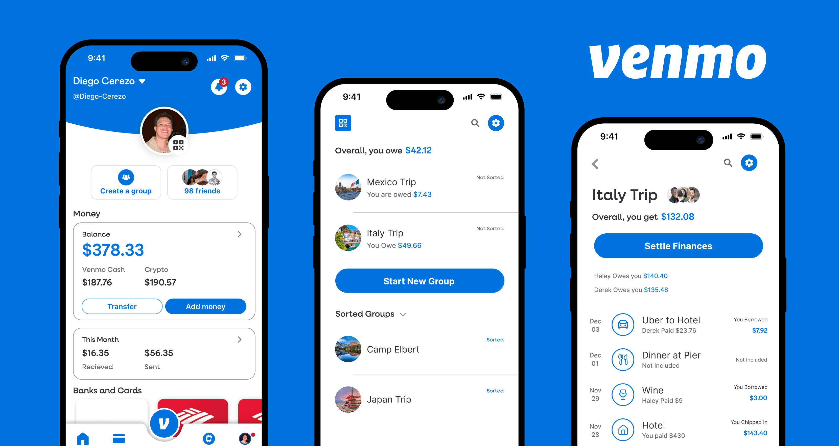
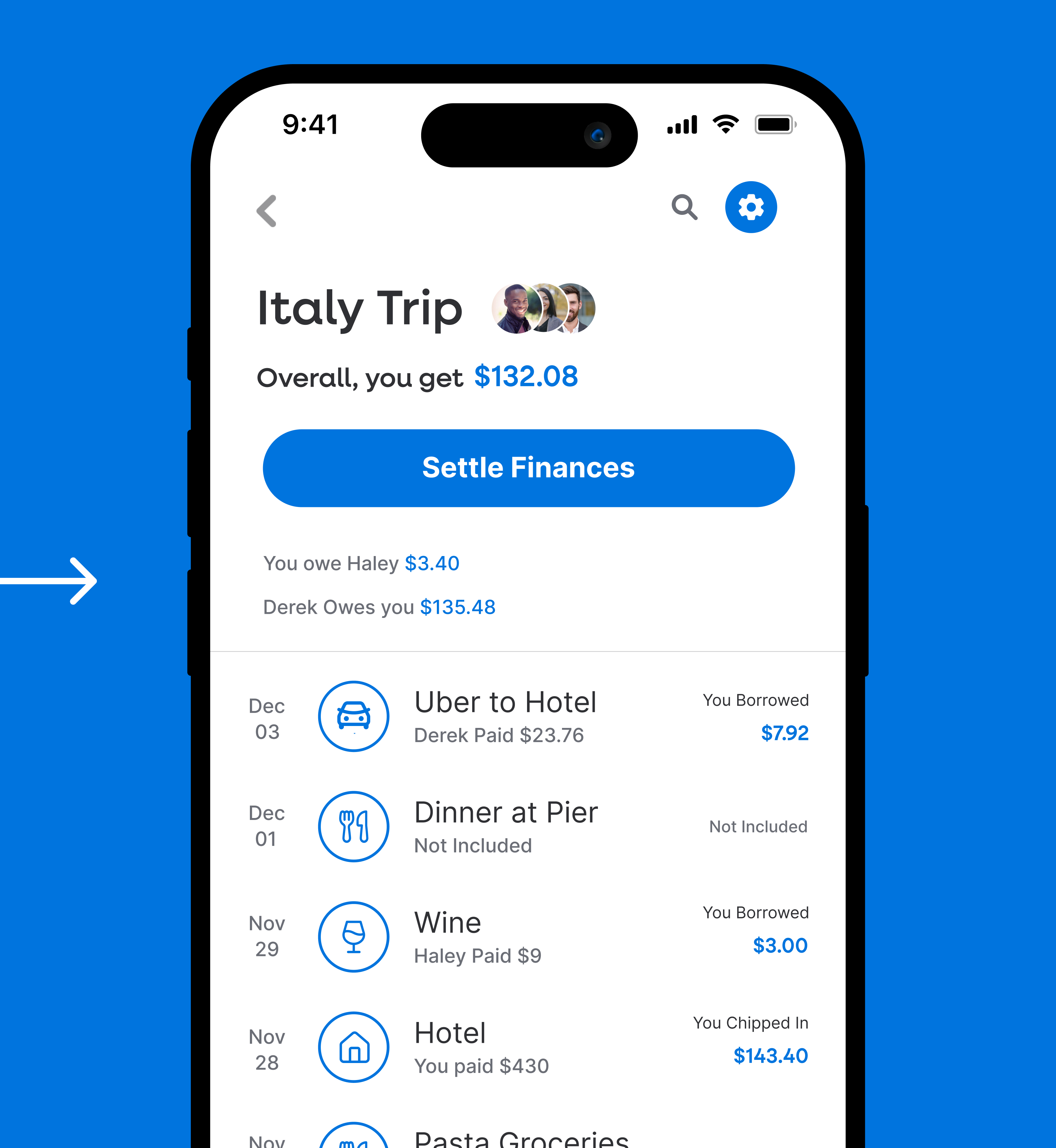
Trips Feature
A unified group expense tracker built directly into Venmo. Users can create a trip, add participants, log shared expenses in real-time, and settle up with one tap; replacing Splitwise entirely.
Redesigned Payment Flow
Flipped the flow to prioritize transaction details (amount, note) before recipient selection. This matches users' mental model and reduced payment completion time by 28%.
Recurring Payments
Visual indicators and a simplified setup flow for recurring transactions like rent, subscriptions, and regular splits (projected to drive 12% growth in recurring usage.
Financial Visibility
Redesigned profile page with clear balance visibility, spending patterns, and crypto tracking (filling the financial management gap users identified in interviews.

The redesigned experience.

I love being able to pay using recurring payments; it saves so much time and I don't have to stress about remembering to send rent money.Michael Chen · Venmo user since 2017
Key iterations from testing.
Simplifying the Trips UI
Early prototypes had too many steps to create and manage a trip. Based on usability testing feedback, I reduced the flow to minimize clicks; creating a trip, adding expenses, and settling up each take fewer than three taps.
Recurring payment indicators
Users wanted to see at a glance which payments were recurring vs. one-time. I added visual badges and a dedicated recurring section to the payment history, making the distinction immediately clear without adding clutter.
Killing the social feed focus
96% of users surveyed didn't care about other people's transactions. The redesign de-emphasized the public feed in favor of the user's own financial activity, trips, and payment history, aligning the UI with what people actually use Venmo for.
Profile as financial dashboard
The redesigned profile page surfaces balance, spending patterns, and crypto in one place. Rather than burying this data in separate screens, users get a clear financial snapshot immediately, turning the profile from a vanity page into a utility.
From payment app to financial tool.
This redesign transforms Venmo from a simple peer-to-peer payment app into a comprehensive financial management tool. By integrating shared expense tracking, streamlined payment flows, and improved financial visibility, Venmo can better serve its growing user base.
Beta testing at scale
Launch beta testing with a larger user group to validate improvements beyond the initial 30-person usability test and gather quantitative data on the Trips feature adoption.
Platform integrations
Explore integrations with travel and event-planning platforms to enhance the Trips feature, pulling in flight costs, hotel bookings, and activity expenses automatically.
Expanded financial tools
Further develop the spending patterns and crypto management features based on user feedback from the redesigned profile dashboard.